
For more than a decade, Proven has partnered with the Share & Care Foundation to advance healthcare, education, and community development across India.
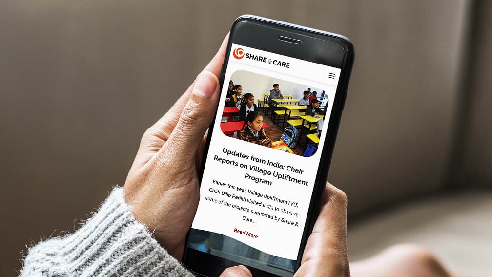
In February 2024, we led a modern redesign of Share & Care’s WordPress site to enhance visibility, simplify content management, and streamline donor pathways. The refreshed platform aligns with a mission that has powered 850+ projects across 15 Indian states and stewarded more than $84 million in impact over 40 years. Clearer storytelling, improved navigation, and a more intuitive donation experience now help supporters connect with Share & Care’s work more quickly and with greater confidence.
Our Challenge
Before the redesign, Share & Care’s site presented three persistent barriers.
- The visual design had grown dated and no longer reflected the vitality of the organization’s mission or the breadth of its programs.
- Day-to-day content updates were time-consuming for administrators, slowing communications around programs and appeals.
- While rich information existed, program structures and calls to action were not consistently surfaced, making it harder for donors, partners, and stakeholders to understand impact and how to take the next step.
Our Objectives
The mandate was straightforward: modernize the site to make it easier to use, manage, and understand. Specifically, we set out to elevate the visibility of Share & Care’s Signature Programs, reduce friction in donor journeys, and give internal teams flexible tools to tell their story without relying on developers.
Our Approach and Solution
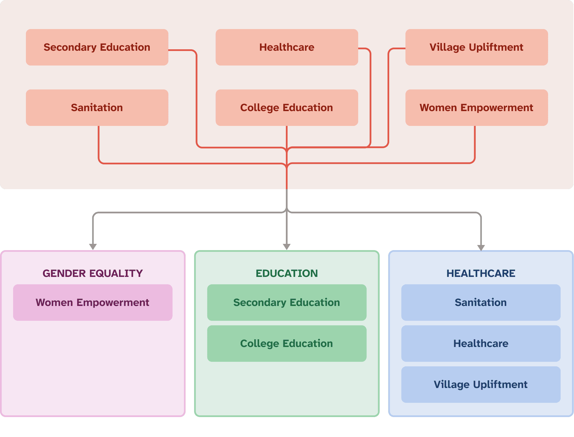
We began with information architecture, reorganizing content to foreground the organization’s four Signature Programs — Educate 2 Success (E2S), Educate 2 Graduate (E2G), Healthcare 2 Unreached (H2U), and Women Empowerment (WE) — while presenting Disaster Relief as an always-ready capability that activates when needed. This structure brought clarity to who each program serves, how each creates change, and where a visitor can take action.
Our UX strategy and UI design followed suit, introducing purpose-driven navigation, consistent page patterns, and scannable content blocks that answer three essential questions at a glance: what the program does, who it benefits, and how to get involved.
A refreshed visual system improved readability on both mobile and desktop, reducing cognitive load and helping diverse audiences quickly orient themselves.
On the engineering side, we delivered a stable, extensible WordPress build with reusable components and page templates — enabling routine updates, program highlights, and news posts to go live quickly and consistently. We also streamlined the giving journey and integrated Classy, enabling supporters to move from learning to donating in fewer steps with clearer prompts.
To preserve and grow organic visibility, we focused SEO efforts on what mattered most at launch: on-page optimization guided by keyword-informed headings and metadata, a comprehensive 301 redirect map to protect equity from legacy URLs, and a clean XML sitemap to help search engines re-crawl the site effectively.
What We Delivered
This redesign represents a true digital transformation for a long-standing partner. The site now elevates program visibility and impact storytelling, while a unified content strategy improves communications with donors, community partners, and internal stakeholders. The platform improves operational efficiency by accelerating and streamlining publishing, enabling the team to focus on the mission rather than maintenance. It is designed to grow alongside Share & Care’s work, supporting education, gender equality, and healthcare initiatives, and activating disaster relief communications when crises arise.
The results are qualitative by design in this phase: a clearer narrative, reduced friction for both visitors and staff, and a stronger alignment between the organization’s digital presence and its real-world impact.
We also work with Share & Care on an ongoing digital marketing retainer that keeps the site fresh and helps raise and spread awareness of their important work through email and social media marketing, as well as other outreach strategies, as part of their donor campaign.
Proof Points
Share & Care’s reputation and reach underpin the redesigned experience. The organization has supported 850+ projects across 15 states in India, with more than $84 million invested over its 40+ years of operation. Third-party credentials reinforce trust: a Four-Star rating from Charity Navigator and a Candid Gold Transparency Seal. Presenting these proof points within a modern, navigable site allows prospective donors and partners to understand credibility at a glance and proceed with confidence. Since the new site launch, Share & Care’s share of organic traffic has increased from 72% to 95% among competitors, demonstrating how improved discoverability amplifies the organization’s mission and extends its reach to new supporters.
Why This Matters for Nonprofit Leaders
Many mission-based organizations grapple with the same hurdles Share & Care faced: legacy websites that limit storytelling, content operations that slow communications, and donor pathways that aren’t obvious. By pairing a clarified information architecture with a modular WordPress implementation, a clean and accessible UI, and launch-ready SEO fundamentals, we created a platform that communicates impact quickly, reduces the effort required to keep content current, and supports campaign agility. From evergreen giving to urgent appeals, Share & Care no longer has to reinvent the process every time.
For nonprofit leaders, this approach translates into a site that works as hard as the organization does: credibly, coherently, and ready to scale.
At the center of our work is the humanity that connects us all – including our experts and yours. Let us craft proven solutions for your most pressing challenges.
Related Insights