This is part two of our examination of the humble button. If you haven’t already, be sure to check out our previous post about button basics. In it, we covered what makes a button — its shape, styling, hierarchy, and states. Now, let’s dive into how you can ensure your buttons are accessible and use inclusive design practices.
Color Contrast
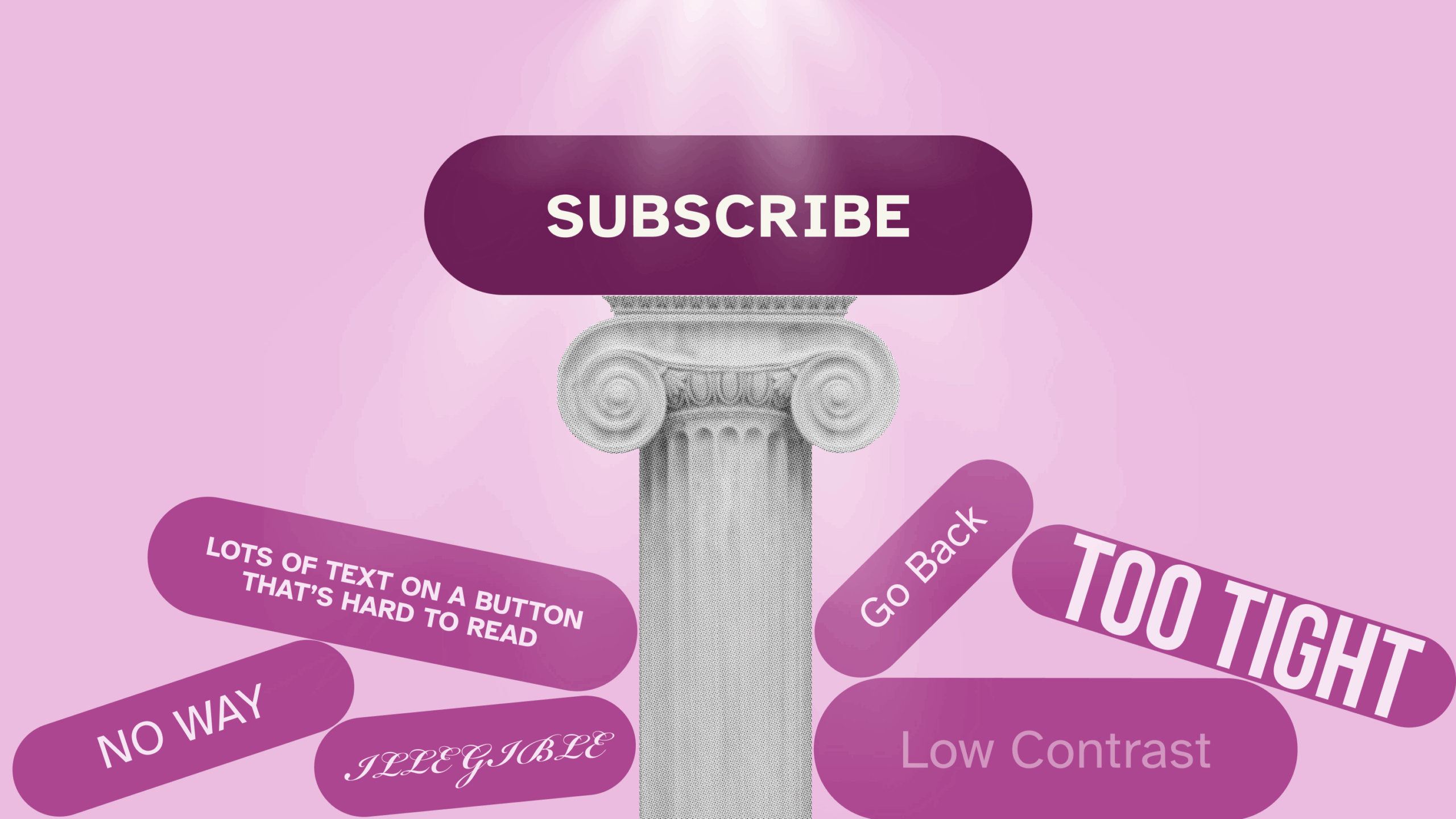
Buttons can typically have up to four colored elements: text, fill, stroke, and icons. All elements must pass color contrast checks so that users with visual disabilities, such as low vision or color blindness, can see and interact with the button.
Without delving too deeply into the science behind it, color contrast measures the difference between the perceived colors of foreground and background elements. Contrast ratios refer to the foreground color being a given multiplier darker or lighter than the adjacent background color. For example, a contrast ratio of 3:1 or “3 to 1” means that the foreground color is three times lighter or darker than the background color.
The math behind calculating these ratios is rather complex, so I’d recommend using a digital color contrast checking tool such as Adobe Color Contrast Analyzer or WebAim Contrast Checker to ensure the colors you’re using pass accessibility checks.
Now let’s break down a button by its parts and their respective contrast ratio requirements:
- Text: In accessibility, text is divided into two sizes, large and small. Large text is considered to be at least 18 points (~24 pixels) or 14 points (~19 px) bold1 Small text is text smaller than 18 points.
- Large text needs a 3:1 contrast ratio from the button fill or the adjacent background color.
- Small text needs a 4.5:1 contrast ratio from the button fill or the adjacent background color
- Fill: A button with a fill must have a contrast ratio of at least 3:1 from the adjacent background color.
- Stroke: If a button has a stroke (also known as outline or border), it must have a contrast ratio of at least 3:1 from the adjacent background color
- Icons: A button with an icon must have a contrast ratio of at least 3:1 from the button fill or adjacent background color.
- State changes: Any button state variations, such as hover or focus, must also pass contrast checks, with each element (text, fill, stroke) passing their respective ratios for each state.
Touch Target
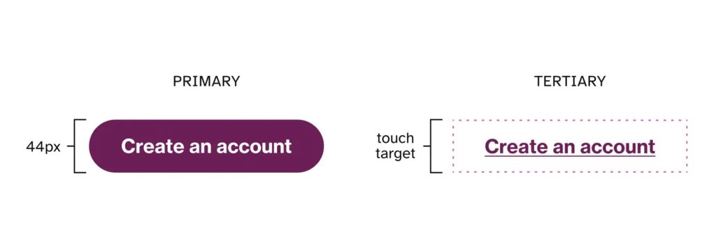
A touch target is the size of the clickable area of any given element, generally the minimum size for usability. Not everyone has an easy time hitting a tiny element with their mouse, finger, or other pointing device.
WCAG 2.1 states that touch targets must be at least 24×24 pixels, and 44×44 for AAA compliance. While you’ve got some wiggle room there, keeping your larger button touch target to 40px and above is a good idea. For reference, Google’s Material Design specifies 44px, while Microsoft recommends at least 40px. Even if a button or object is visually smaller than the target size, consider increasing its touch area to activate it.
Labels
Getting your button text right is critical for button success. There are a few simple guidelines for labeling well-performing buttons:
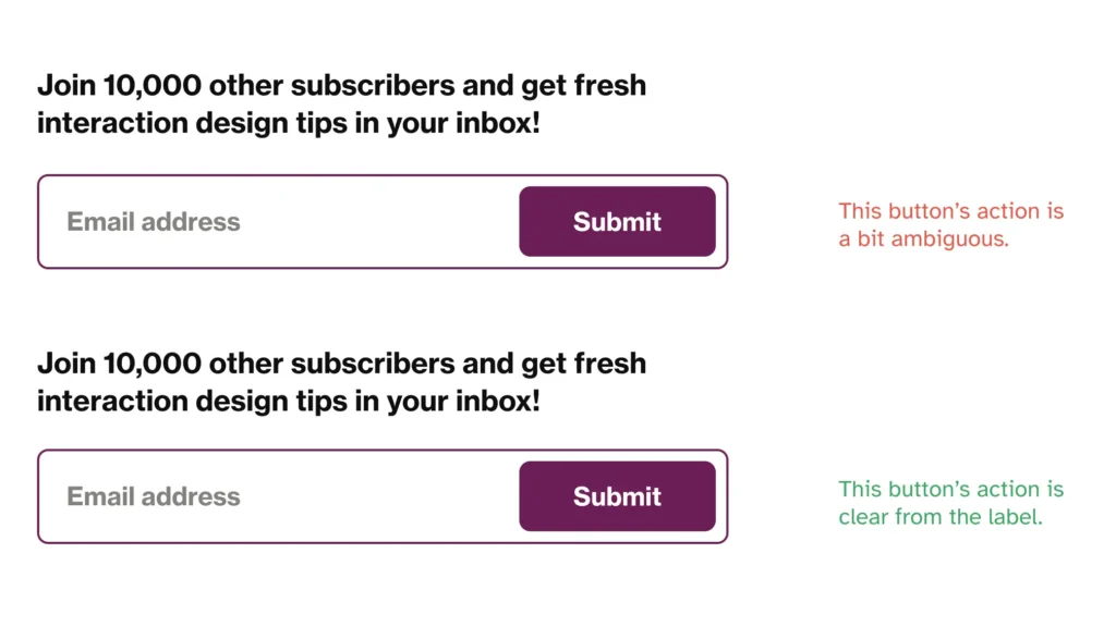
- Use action verbs. “I’m Done” doesn’t communicate what the button accomplishes, whereas “Submit Registration” does. The purpose of the button should be as clear as possible.
- Use words that are specific to the context. For example, when updating a blog post, instead of “Submit,” try “Publish.”
- Use consistent sentence structure. If one button says “Sign up,” the next should be “Register.” Or pair “Sign up for updates” with “Register your account.”
- Keep it brief. The longer a button’s label, the more it deviates from looking like a button. There’s also a higher chance of the button breaking at smaller breakpoints. Try not to exceed 3 to 4 words, but ideally condense it to 1 or 2.
- Choose your letter case thoughtfully.
- Sentence case and title case are generally safe choices, but avoid title case for longer labels.
- All-caps can be appropriate for formal, professional, or technical contexts and design, but it often feels like shouting and isn’t the best choice for readability.
- All lowercase is rarely used, but it can work for very casual or friendly designs.
Icons
In addition to color contrast, there are a couple more considerations to consider with icons to ensure they are accessible and usable.
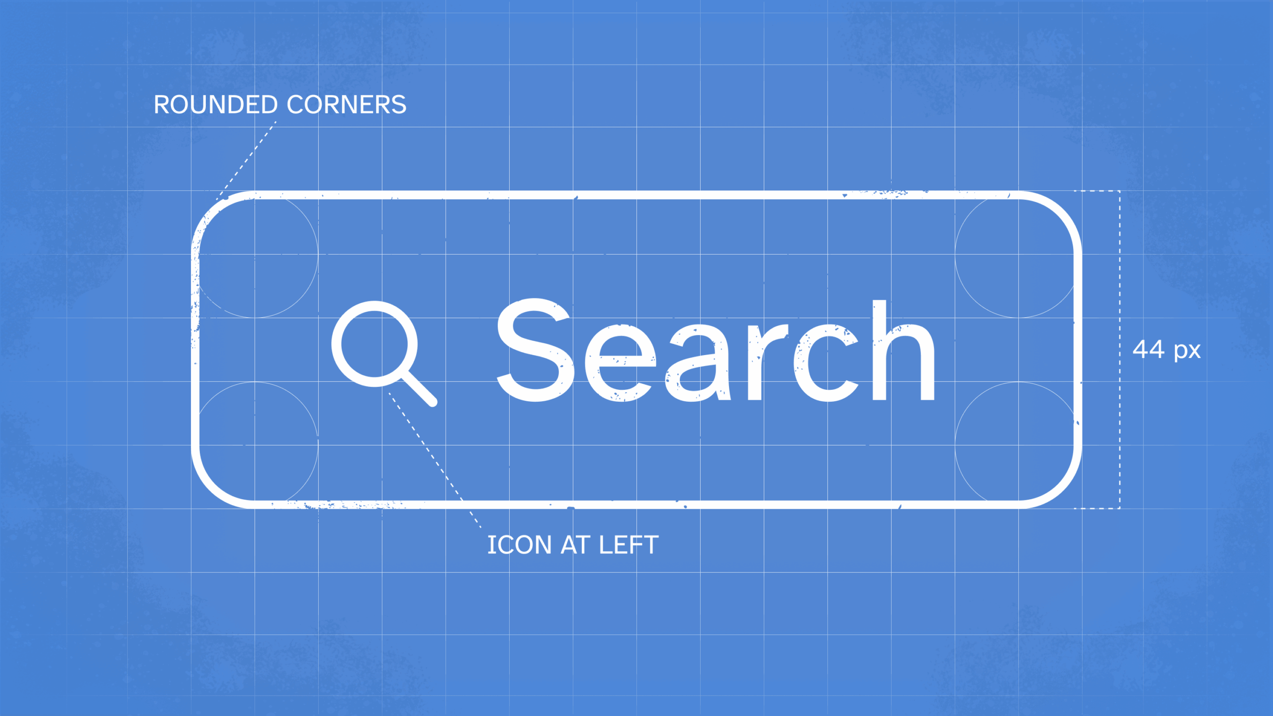
- Icons should typically be located to the left of the text. Icons are meant to give a visual hint to the following text, so they’re most useful on the left. Some exceptions include buttons that indicate direction (such as an arrow pointing to the right being located to the right of the label.)
- Give icons some breathing room. Ensure there is a healthy gap between the icon and the text. Standard horizontal padding rules apply to the icon and text as a whole.
Screen Reader Considerations
We talked about button states (hover, clicked, disabled, focused) in our previous article, but we’d be remiss if we didn’t revisit the focus state of your button when talking about accessibility.
Screen readers and keyboard-only users don’t navigate your website using a mouse. Instead, they use keyboard shortcuts such as “Tab” to navigate your content. The focus state of a given component — in this case, a button — refers to how the appearance of that button changes when a user tabs onto it.
Buttons must have focus states to be accessible. There must be a visual indication that a button is focused on so that sighted users of varying ability know what they are interacting with. While most screen readers account for this by including built-in focus states, this doesn’t encompass keyboard-only users. Therefore, always consider designing a dedicated focus state for your buttons (and all of your components).
Focus states are commonly designed with a solid or dashed stroke a few pixels thick surrounding the button and offset by a couple of pixels.
Additionally, when screen reader users focus on a button, the content announced by the screen reader should contain all the information a sighted user would visually understand from the surrounding context.
- A “Read More” button preceding a preview of blog text should read out “Read more about [blog title].”
- A notification bell icon with the number “5” adjacent to it should read out “Notifications, 5 unread ” instead of just “Notifications.”
When evaluating a button’s announced content, ask yourself, “Does the current label provide sufficient information to know what the button does, without seeing the surrounding visuals and context?” If the answer is “no,” you should likely add more information to the announced content.
Be A Good Digital Citizen
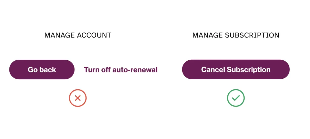
Don’t use your newfound knowledge for evil, a.k.a. deceptive patterns that intentionally mislead your users. Some examples of this include:
- Making the paid option (e.g., pro subscription) visually dominant while hiding the free option.
- Placing harmful buttons or destructive actions where accidental taps are likely.
- Making “Accept All” prominent and colored while “Customize Settings” is grey text that looks non-interactive.
It’s Worth the Effort
This might sound complex for a little button, but we promise it’s worth it. In the United States alone, just over 1 in 4 people experience disabilities daily. That’s a quarter of the population that may find your product difficult or impossible to use, causing harm to these individuals and driving them to drop your product in favor of an accessible one.
While this represents a considerable percentage of market share, remember that accessibility is about people, not compliance. If you treat accessibility like a checklist, you’ll miss the point of why we pursue accessible products. It’s so that anyone, regardless of their ability or disability, can have an equitable experience living in our world today.
By ensuring your buttons are accessible, inclusive, and kind to your users, you can ensure a click-worthy user experience.
At the center of our work is the humanity that connects us all – including our experts and yours. Let us craft proven solutions for your most pressing challenges.
Related Insights