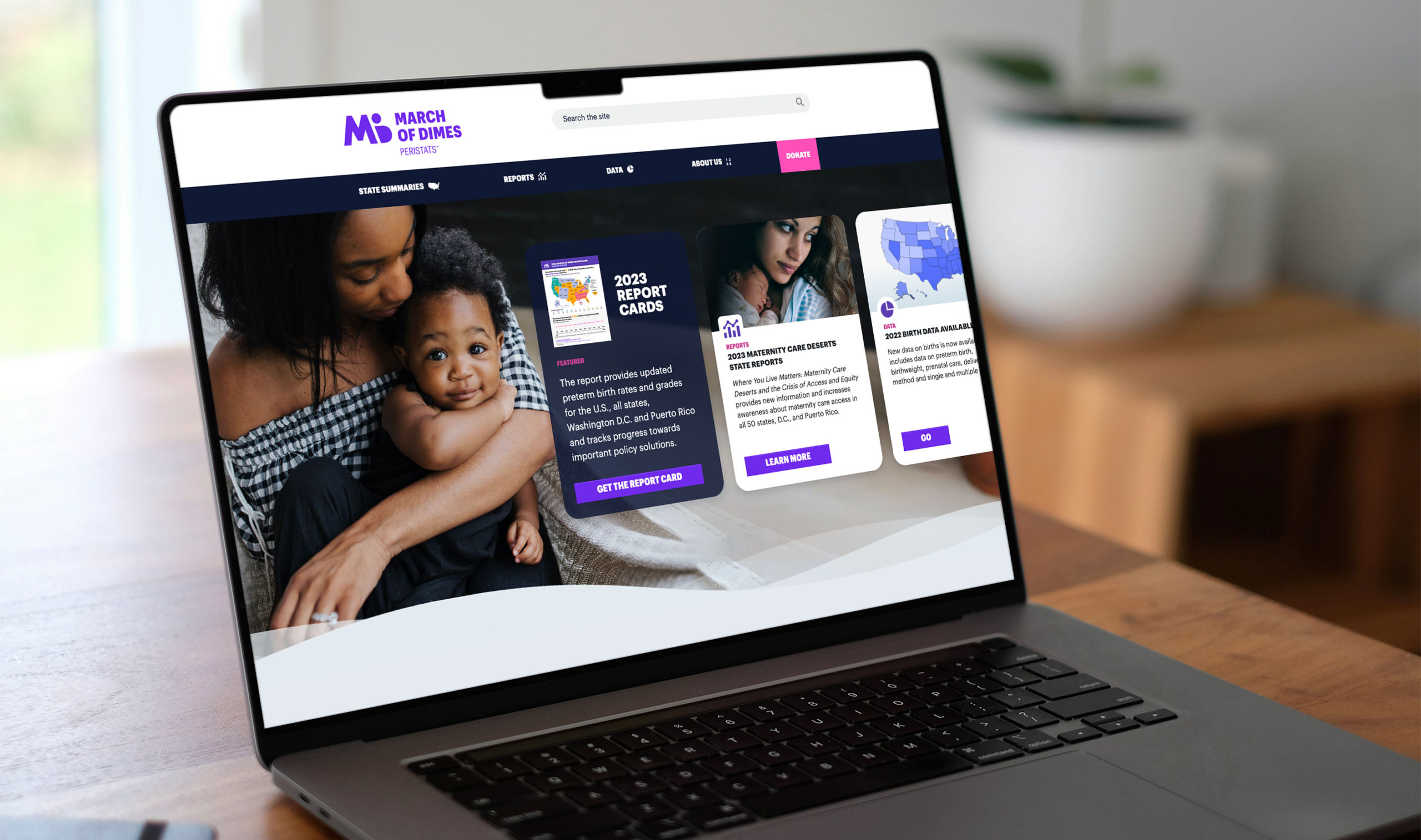

Behind every preterm birth statistic is a family’s story. When March of Dimes approached us with 15 years of maternal health data, they weren’t asking us to create charts. They were asking us to help communities tell the stories hidden in those numbers, stories that could prevent other families from experiencing loss.
In public health, powerful visualizations don’t just display data, they put that data directly into the hands of the communities who need it most. Yet critical health insights often remain trapped in spreadsheets, inaccessible to residents, advocates, and local organizations fighting for change in their neighborhoods.
Data Humanism and Public Health
We approach each data visualization project with the belief that every data point tells a human story. So when we are tasked with visualizing a “15% preterm birth rate,” we know that we are actually being asked to help the 15 out of every 100 babies born too early and their families struggling to support them, whose monumental experiences demand action.
This philosophy guides how we design every public health visualization. Our March of Dimes geographic mapping doesn’t just show state-by-state preterm birth rates, it’s a visual narrative of expectant mothers facing the highest risks in our country, revealing patterns that need to be visually engaging in order to attract public attention and targeted intervention.
Complex health data can overwhelm non-experts, but when you transform it into compelling narratives it can become a powerful tool for change. Our interactive visualizations allow community activists to discover their community’s health story while ensuring researchers, policymakers, and affected families access the same insights.
We’ve seen how the right visualization can change everything. Health data doesn’t just inform decisions, it empowers communities, influences policy, and ultimately saves lives.

Start With Questions Before Solutions
Our public health visualizations start with three questions:
- What health outcomes are you trying to influence?
- Which communities need this information most urgently?
- How will different stakeholders use these insights to take action?
These questions shape our technical approach, but strategic questions are only the beginning. Our 20+ year partnership with March of Dimes has taught us that impactful visualizations honor the humanity behind data while creating meaningful change. This deep experience distinguishes our approach from general-purpose visualization firms. We understand not just technical challenges, but the unique ethical and communication requirements of health data that affects real lives.
Working with sensitive health information means grappling with complex ethical questions that don’t have easy answers:
- How do we ensure community voices shape how their data is presented?
- How do we balance transparency with privacy?
- How do we protect vulnerable populations from data breaches while making critical health information accessible?
The answers to these questions determine whether data visualization becomes a tool for empowerment or exploitation.
Transforming Data into Advocacy
When communities can see their own stories reflected in data, visualization transforms from passive information display into active advocacy tools. This shift from observation to action represents the most powerful application of data humanism in public health.
Community-Driven Discovery Creates Change
The most impactful public health visualizations emerge when communities control how their data is presented. In Louisiana’s “Cancer Alley,” residents used FracTracker’s interactive mapping platform to document the clustering of petrochemical facilities around their homes. These community-created visualizations didn’t just show pollution sources—they provided the evidence base that helped residents fight back against environmental racism, transforming personal health experiences into documented patterns of systemic harm.
Similarly, Oakland’s Community Action to Fight Asthma (CAFA) empowered residents to map local air pollution sources affecting children with asthma. Their community-created visualizations revealed the clustering of polluting businesses near schools and homes, providing the evidence that led to California’s first Community Benefits Agreement and secured $2.5 million for health-promoting investments. The American Journal of Public Health study documenting this work shows how resident-led mapping creates both immediate advocacy tools and long-term policy change.
Professional Tools Enable Grassroots Action
Our work with public health organizations demonstrates how professional-grade visualization platforms can democratize access to advocacy-ready materials. The PH WINS dashboard we developed for the de Beaumont Foundation includes downloadable PNG and PowerPoint formats specifically because we understand that data becomes actionable when it can be easily shared in community meetings, policy briefings, and funding proposals.
Each PH WINS visualization can be downloaded with its key takeaways intact, allowing local health departments and community advocates to incorporate workforce data into their own presentations. This multi-format accessibility transforms complex survey data into grassroots advocacy ammunition — exactly what communities need to secure resources and drive policy change.
Personalization Drives Ownership
The pathway from data to advocacy runs through personalization. When users can filter PH WINS data by their specific region, demographic, or professional role, they’re not just viewing statistics — they’re discovering their community’s unique story within the larger public health landscape. This personal connection transforms passive data consumption into active engagement.
Our experience shows that the most effective advocacy visualizations offer multiple entry points: the data expert can download raw datasets, the community organizer can grab presentation-ready slides, and the concerned parent can share simplified infographics on social media. This multi-format approach ensures that critical health insights reach every stakeholder who can act on them.
When communities can customize how they view and share their health data, they gain ownership over their narrative. And when people own their story, they fight for change.
Using AI to Remove Barriers to Community Action
The same principles that make community-driven visualization powerful — accessibility, personalization, and actionable insights — can become exponentially more effective when enhanced by artificial intelligence.
Simplifying Data Interaction
Community advocates shouldn’t need data science degrees to access their own health information. Natural language processing can eliminate the technical complexity that keeps residents from exploring datasets about their neighborhoods. When a parent can ask “Show me childhood asthma rates near schools in my area” without learning database syntax, data visualization becomes truly democratic.
Discovering Unexpected Patterns
Machine learning excels at identifying correlations that human analysts might miss — relationships between environmental factors, social determinants, and health outcomes that warrant community investigation. More importantly, AI can suggest the most effective visualization formats for different advocacy contexts: geographic maps for spatial patterns that support zoning challenges, or timelines for trend analysis that document systematic neglect.
Tailored Advocacy Tools
AI-driven personalization could adapt the same health dataset for different stakeholder needs. Community organizers might see neighborhood-specific insights with advocacy applications highlighted, while policymakers view regional trends with policy implications emphasized. This approach could ensure each user receives information formatted for their role in creating health equity.
Proactive Health Monitoring
Predictive analytics could help communities identify emerging health trends before they reach crisis levels. By analyzing patterns in existing data, these systems might forecast resource needs or highlight areas requiring intervention. This capability could shift community advocacy from reactive documentation to proactive prevention.
These AI enhancements don’t replace the human-centered approach that makes public health visualization effective, they amplify communities’ ability to discover, understand, and act on their health data stories.
The Path Forward
Public health data visualizations continue to evolve with new demands for real-time data integration, interactive user experiences, and customizable insights. Organizations need partners who can adapt to these changing requirements while maintaining focus on the human stories behind the data.
The challenge extends beyond technical implementation to honoring human experiences behind data while serving both mission-driven goals and practical needs. Making health data accessible for those who can act on it means building tools for social change, not just information platforms
Every community has health stories waiting to be told through their data. The question isn’t whether that data exists—it’s whether the people who need it most can access it, understand it, and use it to fight for their families and neighbors.
When we put powerful visualization tools directly into community hands, we don’t just create better charts. We create the evidence base for health equity, one neighborhood at a time. Your community’s health story is already written in the data. The only question is: who gets to tell it?
At the center of our work is the humanity that connects us all – including our experts and yours. Let us craft proven solutions for your most pressing challenges.
Related Work