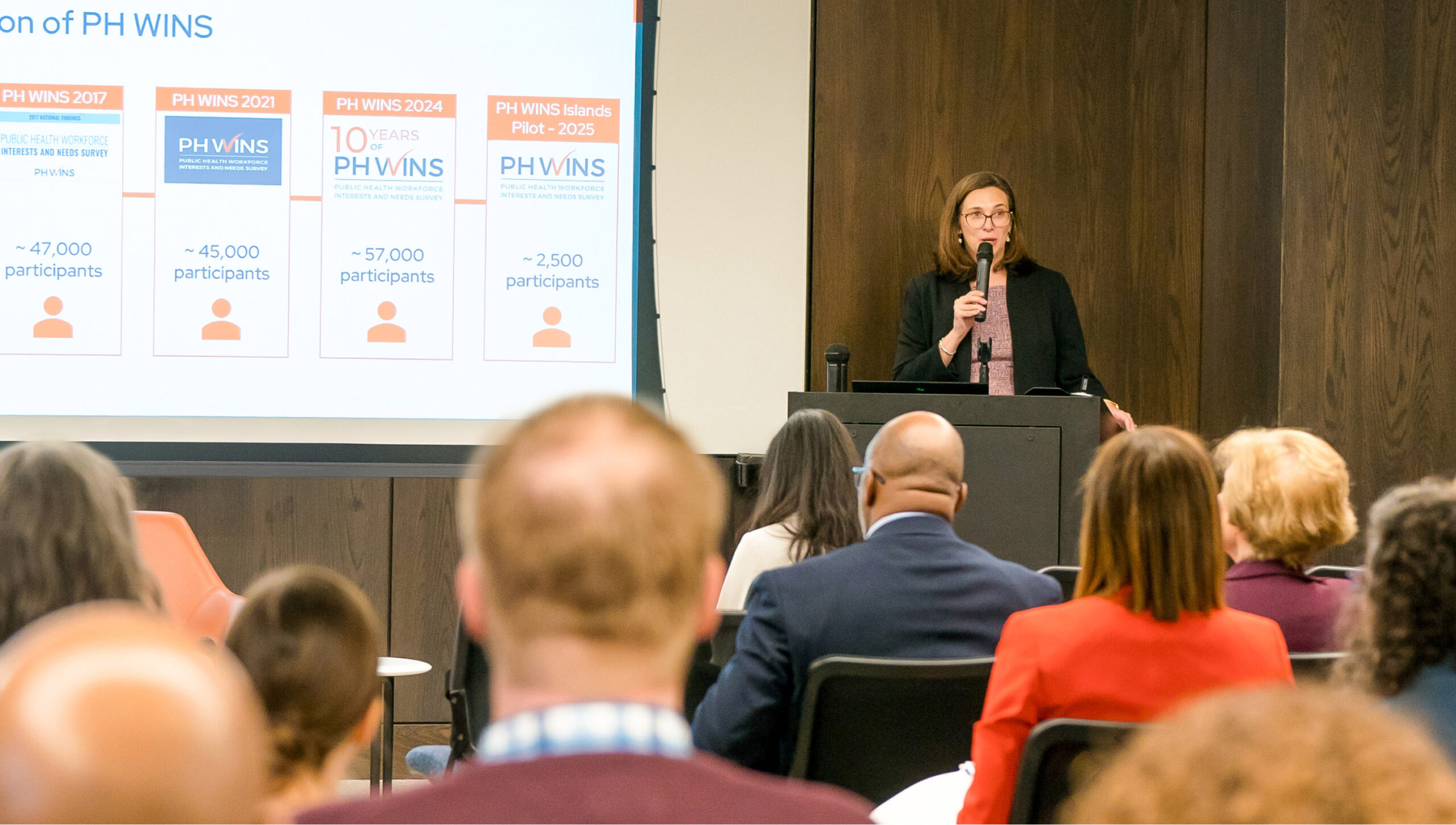
The Public Health Workforce Interests and Needs Survey (PH WINS) is the only nationally-representative source of data about the U.S. government public health workforce.
Conducted by the de Beaumont Foundation and the Association of State and Territorial Health Officials, PH WINS supports public health workers by offering crucial data to inform decisions around funding, training, recruitment, and retention — decisions that impact the health of communities nationwide.
Transforming Data Into Action
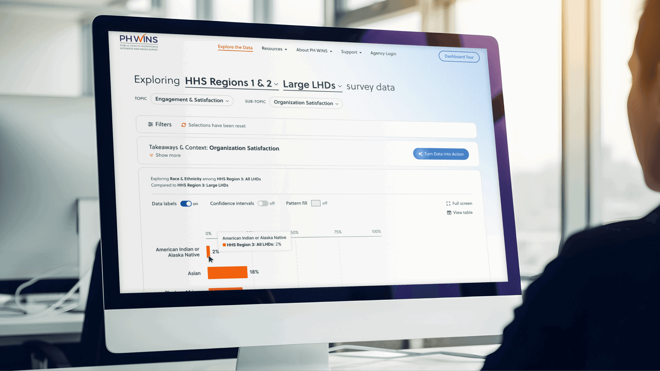
We partnered with the de Beaumont Foundation to reimagine the PH WINS data dashboard for the 2024 survey cycle. Our directive was to modernize the dashboard experience, bring clarity to complex data, and make it effortless for public health leaders, researchers, and policymakers to turn data into action.
Following interviews with stakeholders and subject matter experts, we learned that the challenge we faced was two-fold. First we needed to design a data visualization experience that would feel intuitive to a broad spectrum of users, from first-time visitors to seasoned data analysts, without sacrificing methodological rigor. Second, we needed to provide context and guidance so the dashboard did more than merely display data. It needed to help users interpret uncertainty, explore meaningful and statistically-significant differences, and identify next steps with confidence.
Visualizing Public Health
To bring the PH WINS survey data to life, we created a secure, scalable cloud-based hosting environment and developed a customized Drupal CMS. We also established a multi-layered architecture with redundant AWS containers and a Web Application Firewall. The visualizations are rendered using customized Highcharts graphs. Combined, this infrastructure allows for real-time calculations, dynamic and multi-variate analysis, complex filtering options, and interactive comparisons far beyond what was previously possible.
Laying the Groundwork
We first began by approaching the team’s feedback on the visualization of the previous survey results. With the prior PH WINS dashboard, users found the navigation clunky, filters confusing, data labels unclear, and long pages filled with uniform-style charts difficult to interpret. When viewing the data itself, comparison options were very limited due to the technical restraints of the prior dashboard, inhibiting users’ ability to compare data across populations or survey years.
Adding Clarity & Context
During Discovery, we established that dashboard users fall into groups on two axes: their experience with data and their professional role. Those who fall on the data expert side of the axis are familiar with analyzing and working with complex data, and would be best served by quick access to the underlying data. However, those that fall on the data layperson side of the axis would be best served by robust, friendly onboarding and persistent training through tooltips and easily-accessible guidance and resources.
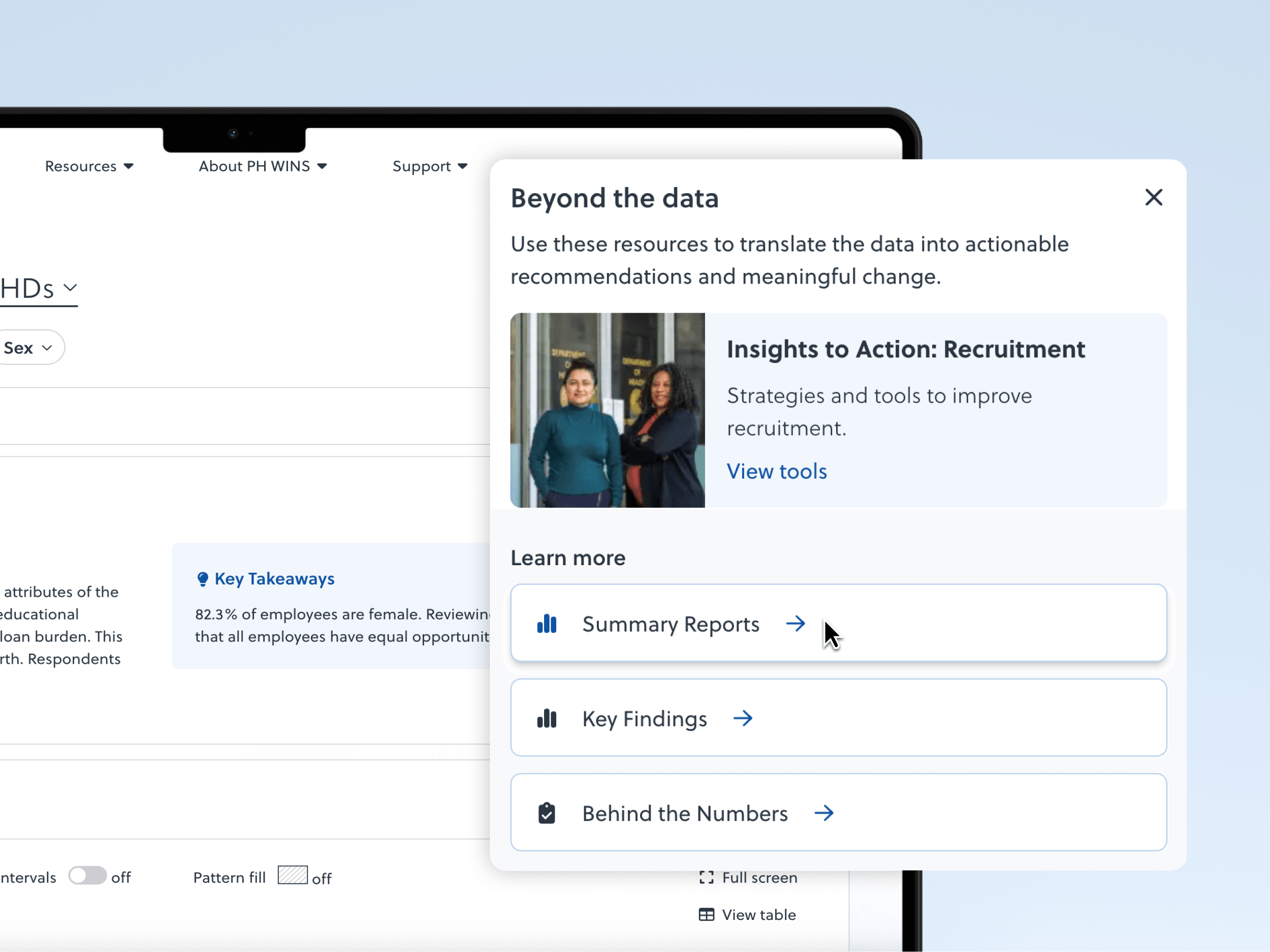
Our design centered around adding clarity for both user groups. With a clean, minimal interface, the focus is on the data. Color is used to highlight what matters, without creating visual clutter. Visual groupings and proximity guide users to related resources, making putting data into action easier. We also added a modal tied to each visualization that allows users to “Turn Data Into Action.” Experienced users can dive deeper into relevant resources and more novice users can learn about key findings and get guidance.
Enhancing Understanding
We complemented our design choices with intentionality of language. Plain-language microcopy and data labels bring insight without confusion, and a comprehensive user guide offers step-by-step instructions on using and interpreting the dashboard. A crown jewel of clarity, though, is the “Data Context” and “Key Takeaways” accordion that accompanies each graph. These additions help data novices understand the data they’re seeing while also providing the methodological background that builds trust with data experts.
Using the Dashboard
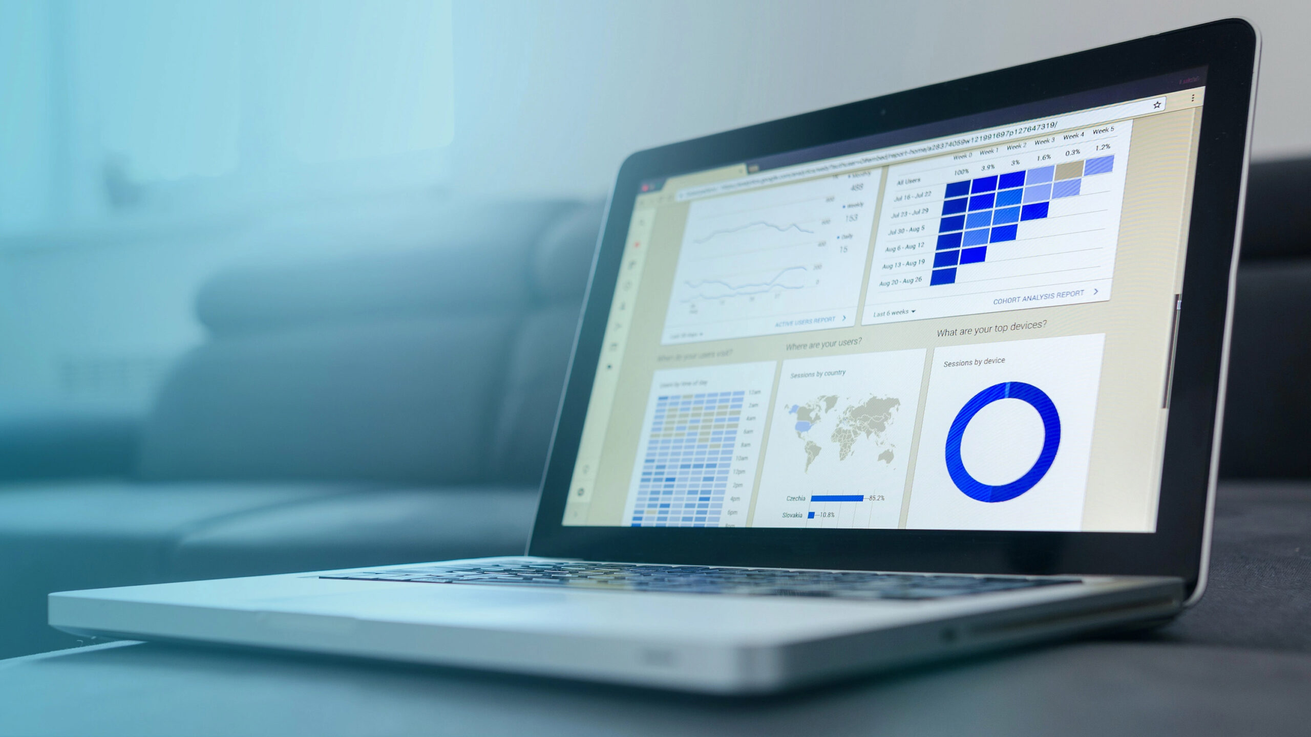
The Explore dashboard is highly interactive, offering topic- and subtopic-level insights through dynamic bar charts and tables. Most visualizations are horizontal bar charts, displaying percentages or point estimates. The vertical axis labels correspond to subtopic categories and adjust dynamically when filters are applied. Users can toggle Confidence Intervals on or off to make uncertainty visible.
To protect confidentiality and statistical validity, PH WINS suppresses results in categories with fewer than 10 respondents. Suppressed data appears as a “Combined View” or is entirely hidden.
Deep Dive Into Data
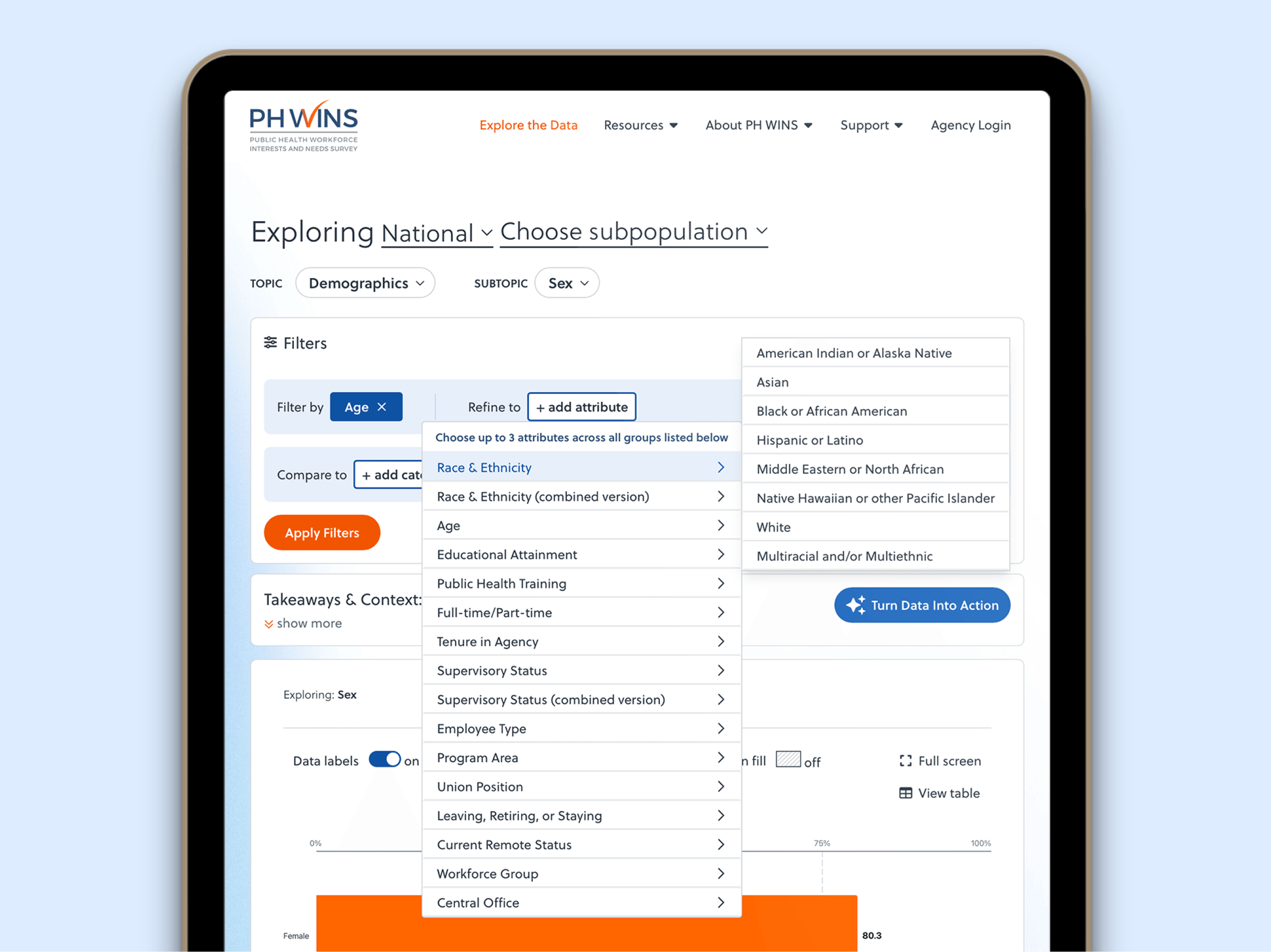
The “Filter By,” “Refine To,” and “Compare To” controls enable deep exploration of the survey data. “Filter By” splits the dataset by category (e.g., “Sex”, “Age”, “Tenure”) while “Refine To” lets you focus on a specific subgroup of up to three selections (e.g. full-time, female staff, age ≤ 35 ). “Compare To” lets you contrast one group with another (e.g. female vs. male).
From Insight to Action
The goal of the PH WINS survey is not simply to provide a benchmark of the public health workforce; it is to leverage the data to guide real-world decisions. As such, each visualization is accompanied by actionable context and resources that offer guidance on turning data insights into workforce strategy. To support public health decision-makers and decision influencers, each chart can be downloaded as a PNG or PowerPoint slide (including the key takeaways) so they can be incorporated into reports and decks as supporting data.
Additionally, each survey population and region has a corresponding Summary Report that can serve as a starting point for analysis, be shared with others interested in the key findings, or be used to present the data in a clear, accessible format.
Looking Forward
Following our first iteration of the PH WINS dashboard, we began immediately working with the de Beaumont Foundation on a new project to expand the survey to a new geographic area and incorporate it into the available data. This is a testament not only to the trust we have built with their team but the future-focused development of the site’s architecture, allowing for adaptation and growth.
At the center of our work is the humanity that connects us all – including our experts and yours. Let us craft proven solutions for your most pressing challenges.
Related Insights