Changing your company name after three decades in business isn’t a decision you make lightly. When we approached our rebrand, we knew one thing: we didn’t want to reinvent ourselves, we wanted to distill what already made us great and realign our brand to let those things shine.
When we transitioned from PRI to Proven a year ago, we knew we were taking on something significant, not just a rebrand, but a true reimagining of how we present ourselves to the world. The emotional weight of that change was real, but so was our conviction that half-measures wouldn’t serve our clients or our mission.
Today, we’re reflecting on what we’ve learned and the results that followed.
Why “Proven” Made Sense
After 30+ years of building trust with mission-driven organizations, we needed a name that reflected both our track record and our commitment to measurable impact. “Proven” encapsulates our dedication to delivering reliable results, reinforcing our long-standing reputation, and the longevity of our organization.
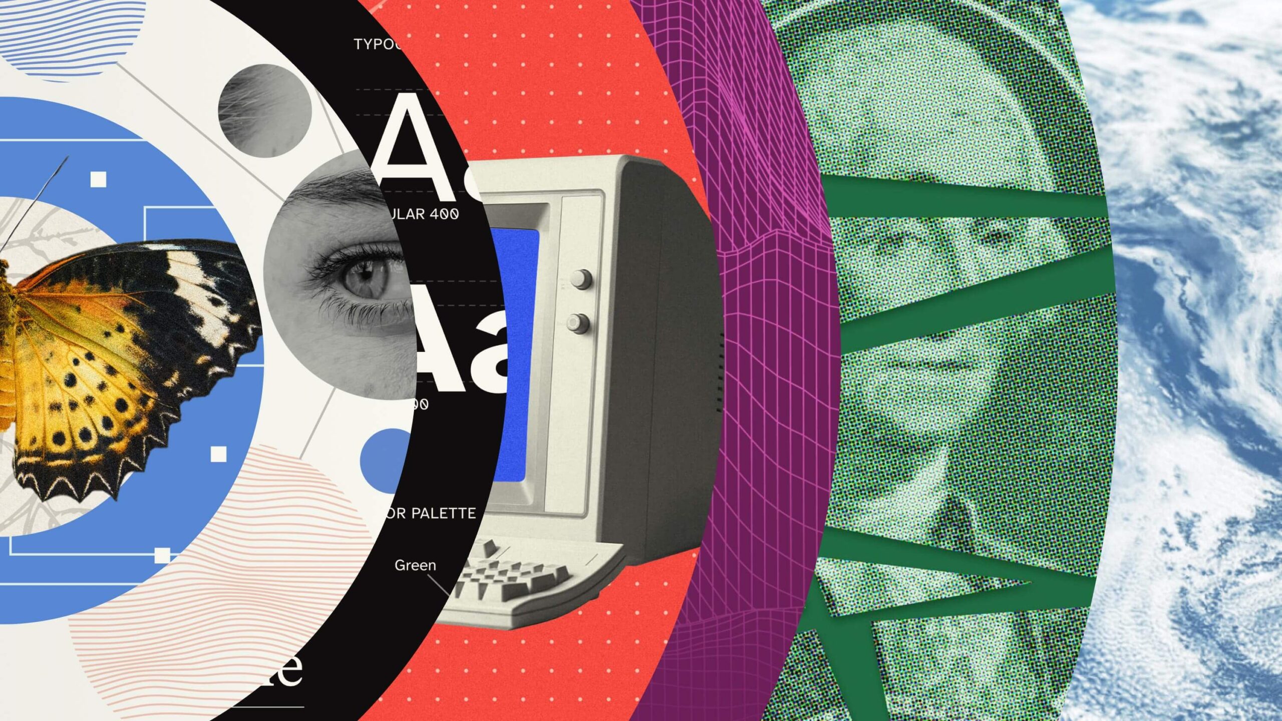
Building a Visual Identity That Works
When you’re redesigning your entire brand presence, every choice has to earn its place. We didn’t just want something that looked good; we needed something accessible, functional, and engaging across every touchpoint our clients encounter.
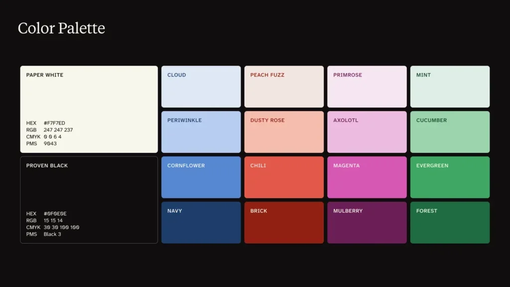
Color As Strategy
The palette we landed on does double duty: it’s bold enough to reflect how we approach partnerships, but flexible enough to work whether we’re presenting to a boardroom, creating data visualizations, or printing materials for a conference. That versatility matters when you’re working with organizations that need to reach everyone from researchers to community members.
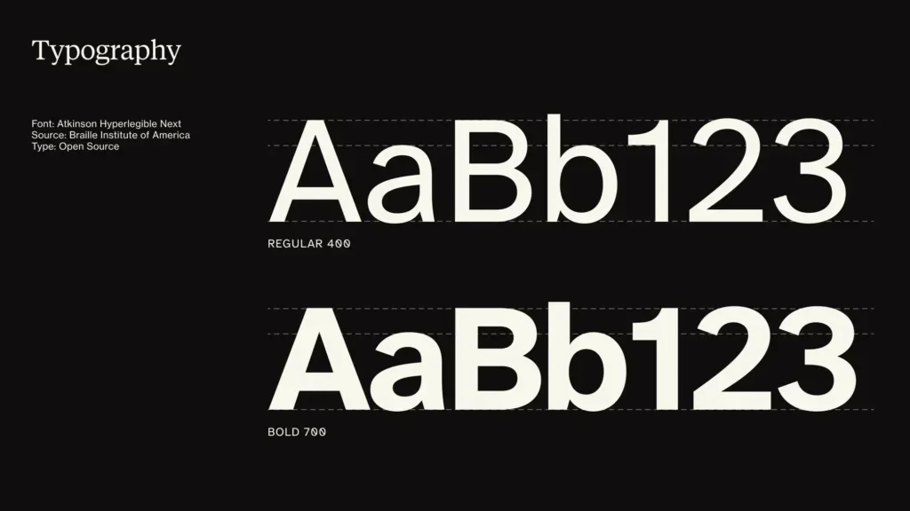
Typography That Actually Serves People
Choosing Atkinson Hyperlegible wasn’t just about aesthetics, it was about accessibility. The Braille Institute designed this typeface specifically for enhanced readability, which aligns with our belief that good design should work for everyone. When we recently upgraded to Atkinson Hyperlegible Next for its additional weights and refined design, we gained more creative flexibility without sacrificing the font’s inclusive foundation.
The Numbers Tell a Story
A year later, our rebrand’s impact is measurable. Our social presence grew significantly with an 112% increase in audience size, 42% more interactions, and a 762% jump in impressions. Those numbers are not merely vanity metrics; they represent more organizations discovering our work and connecting with our mission.
More importantly, our clients are seeing results. We launched 13 projects in 12 months, each one reinforcing that the rebrand positioned us to attract the right partnerships.
New clients like TODOS: Mathematics for ALL trusted us with their comprehensive digital transformation, resulting in a 26% boost in overall site performance and 67% faster page load speeds — improvements that directly support more equitable access to education resources. Our long-standing partnerships continue to evolve and grow. Our work with Immunize.org expanded this year with the launch of LetsGetRealAboutVaccines.org, which maintains a 99% accessibility score with 100% uptime.
What We Learned
Rebranding after decades in business taught us that authenticity can’t be manufactured, it has to be uncovered. The name “Proven” didn’t create our track record; it simply gave us a clearer way to communicate what we’d always been doing. Sometimes the boldest move is the one that feels most true to who you already are.
The process also reinforced something we tell our clients: your brand isn’t just your logo or color palette. It’s every interaction, every project outcome, every moment someone experiences your organization. The visual identity supports that experience, but it doesn’t replace the substance behind it.
Perhaps most importantly, we learned that taking the time to get it right pays dividends you can’t anticipate. The rebrand clarified how we think about our work, how we talk about our impact, and how we approach new partnerships. It gave our team a shared language for what makes us different and our clients a clearer understanding of what they can expect from us.
The Future is Bright
A year in, we’re more confident than ever that we made the right choice. The rebrand wasn’t about becoming something new, it was about becoming more ourselves. And that authenticity resonates in ways that go far beyond metrics and project launches.
We’re attracting clients who understand our approach before we even meet. Conversations start from a place of alignment rather than explanation. The right partnerships feel inevitable because we’re no longer trying to be everything to everyone; we’re being exactly who we are for the organizations that need us most.
Your mission is our purpose, and we’re here to help you find the clearest way to share yours with the world.
Ready to see what a strategic rebrand could do for your organization? Let’s talk about your vision.