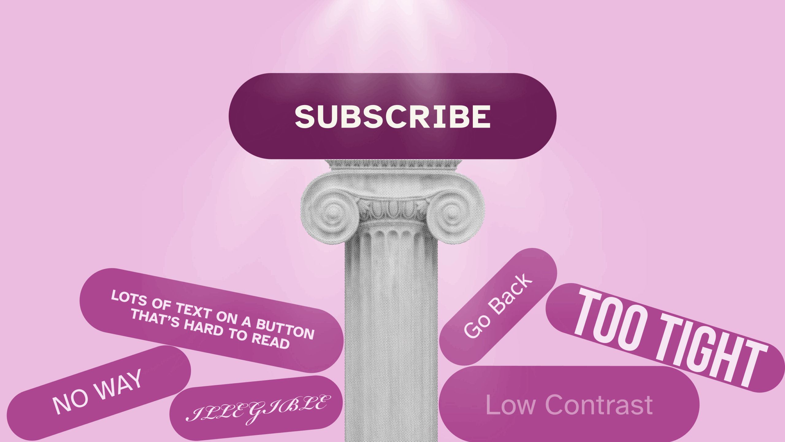
Buttons are arguably the most important interaction elements in any website or app. Buttons are for taking action, and the big stuff you want users to do usually comes down to a specific action or two: create an account, make a donation, and of course, check out.
Yet buttons are rarely given the attention they deserve. So let’s learn how to make buttons as effective and powerful as possible.
What Even Is a Button, Anyway?
Let it be known: a button is not a link. A link takes you somewhere — to another page on the website, an external page, a PDF, etc. A button triggers or facilitates an action, usually occurring on the same page or flow.
Many products and websites confuse or interchange the two. Actions are mistakenly stylized as links, and buttons redirect users. This leads to a muddled experience, in which your users don’t know what to expect when they interact with your product.
To prevent this from happening, ensure you understand the distinction before you begin designing. If you find yourself stuck debating whether an object should be a link or a button, ask yourself this question:
“Will interacting with this object allow the users to do something or go somewhere?”
- Buttons: Do something
- Links: Go somewhere
Understanding this distinction is step one. Step two is making sure your buttons actually look, well, like buttons.
Button Appearance
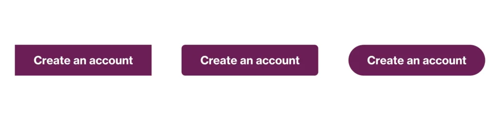
Standard buttons come in three basic styles: square, rounded corner, and pill. Your choice depends on the overall look and feel of your site. Square feels formal, technical, or minimal; pill is friendly or casual; and rounded-corner buttons can be anywhere in between. You also may have seen brands use unique shapes as their buttons, such as a trapezoid, or rectangle buttons with only a couple of rounded corners. Those are all acceptable.
The primary consideration is making your buttons recognizable. This was taken quite literally in early digital design when buttons were designed skeuomorphic, in that drop shadows, raised appearances, and other visual treatments were used to mimic the appearance of buttons in the real world. As time went on and users grew accustomed to interacting with digital products, flat buttons gained prevalence. Now, the pendulum is swinging back, and we’re seeing a more contemporary take on neomorphism emerge in the digital world. Regardless of your style, always ask yourself, “Will my users know this is a button?” If your answer is a resounding “yes,” then feel free to move forward with your design.
Button Hierarchy
Let’s dig into how buttons work in context. As mentioned, buttons are extremely important interaction elements. Your primary button isn’t called a “call to action” for nothing. However, it’s easy to overdo it, which is why you should have a few different types of buttons.
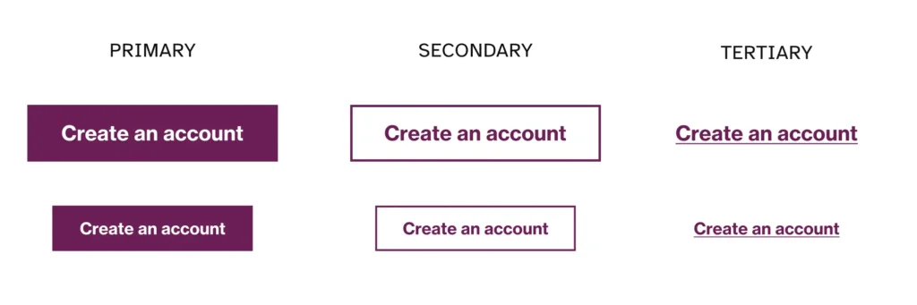
Primary Buttons
Your primary buttons should be reserved for the most important action on a screen, page, or section. It’s common to see more than one on long, scrolling pages with multiple sections, but reserve them for the most important content. Primary buttons usually feature the brand color prominently and are designed to catch users’ attention.
Some examples might include “Next,” “Submit,” or “Publish.”
Secondary Buttons
Your secondary buttons are for actions that are important alternatives but not the primary path for users to take. They’re often paired with a primary button, but they can be standalone if the action in their section is secondary to a primary action outside of their section. Secondary buttons are less flashy than primary buttons and are usually designed with a neutral fill or just an outline.
Some examples include a secondary “Cancel” button next to a primary “Save,” or a secondary “Save as Draft” next to a primary “Publish.”
Tertiary Buttons
Meanwhile, tertiary buttons are low-priority actions that provide additional options without distracting from main tasks. Unlike secondary buttons, tertiary actions often live away from primary buttons and closer to the content where they are most relevant. They are depicted simply, often text with just an underline or accompanying icon.
Some examples might include “Forgot Password?” on login forms or “View All” at the end of a preview list.
You can use size to signal hierarchy as well. For designs with lots of buttons, it’s useful to have your three types in a few size options, such as small, medium, and large.
Button States
Something we all know from real-world interactions: a button isn’t really a button unless you can click it.
Button states are great for passing on subtle cues to a user (interaction feedback) like if something is clickable or if their action did something. They’re also vital for accessibility, since someone navigating with an assistive tool other than a mouse needs the same feedback.
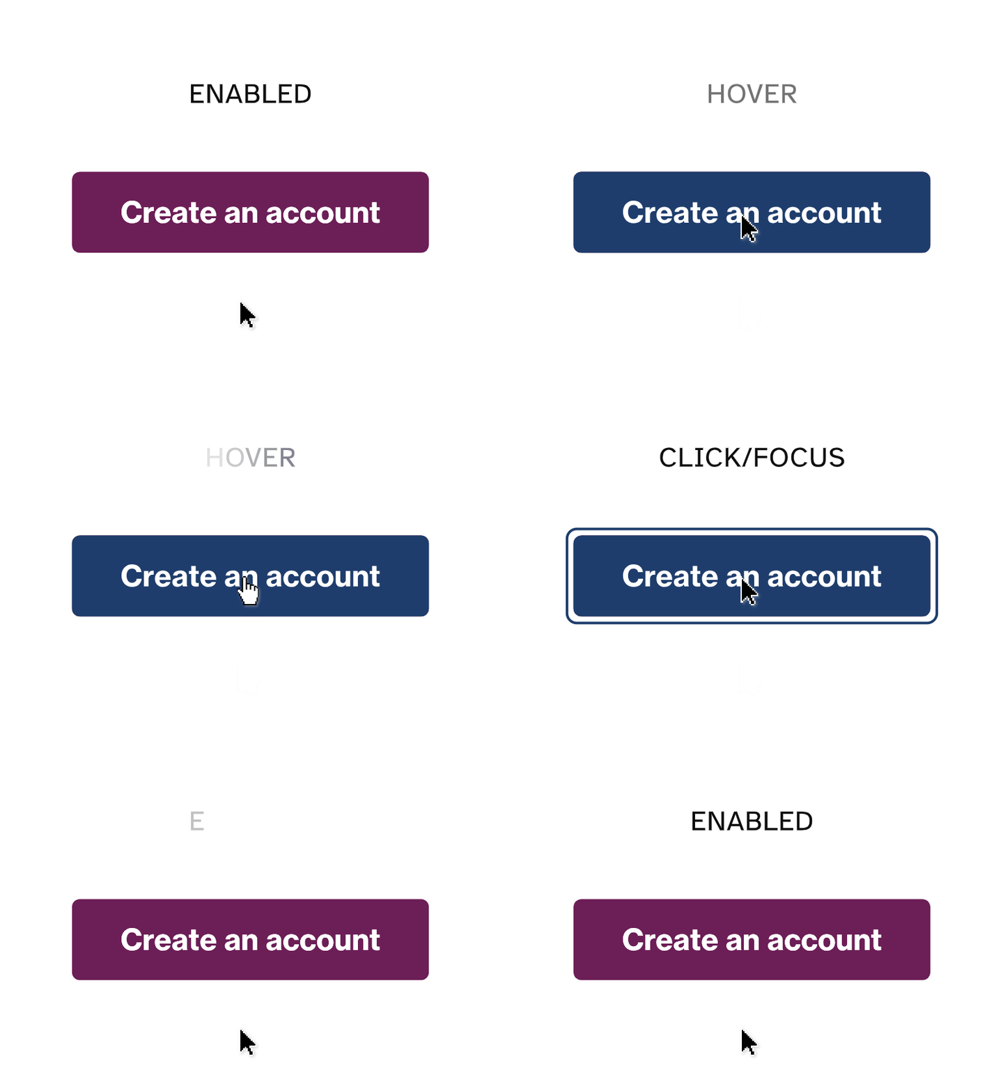
- Hover state: On desktop devices where users mouse over elements, a hover state is the primary method of demonstrating that an element can be interacted with. Some common hover states include changing the fill color, animating movement, or adding a border. Remember, there is no hover on mobile or when navigating via a keyboard or voice tool.
- Click/active state: When a user clicks on a button, this state provides feedback to confirm the action they just completed. These can be subtle changes, like a button moving down to mimic a “pressing” motion, or more visible such as a check mark icon appearing in the button.
- Focus state: These are used for keyboard or voice navigation. Browsers all include default focus states, but you should consider a custom focus state that complements the design of your buttons. Focus states are often designed as offset borders from a given button or component.
- Disabled state: These buttons are inoperable elements, and users need to complete certain criteria to enable them. Since they are inoperable elements, disabled buttons do not have to comply with color contrast rules for accessibility and are often depicted with faint gray outlines and text. That said, the best practice is to avoid disabled buttons entirely when possible.
By giving ample thought to the various button states, we can harness the full potential of buttons and elevate the overall effectiveness of our digital platforms.
Button Proportions
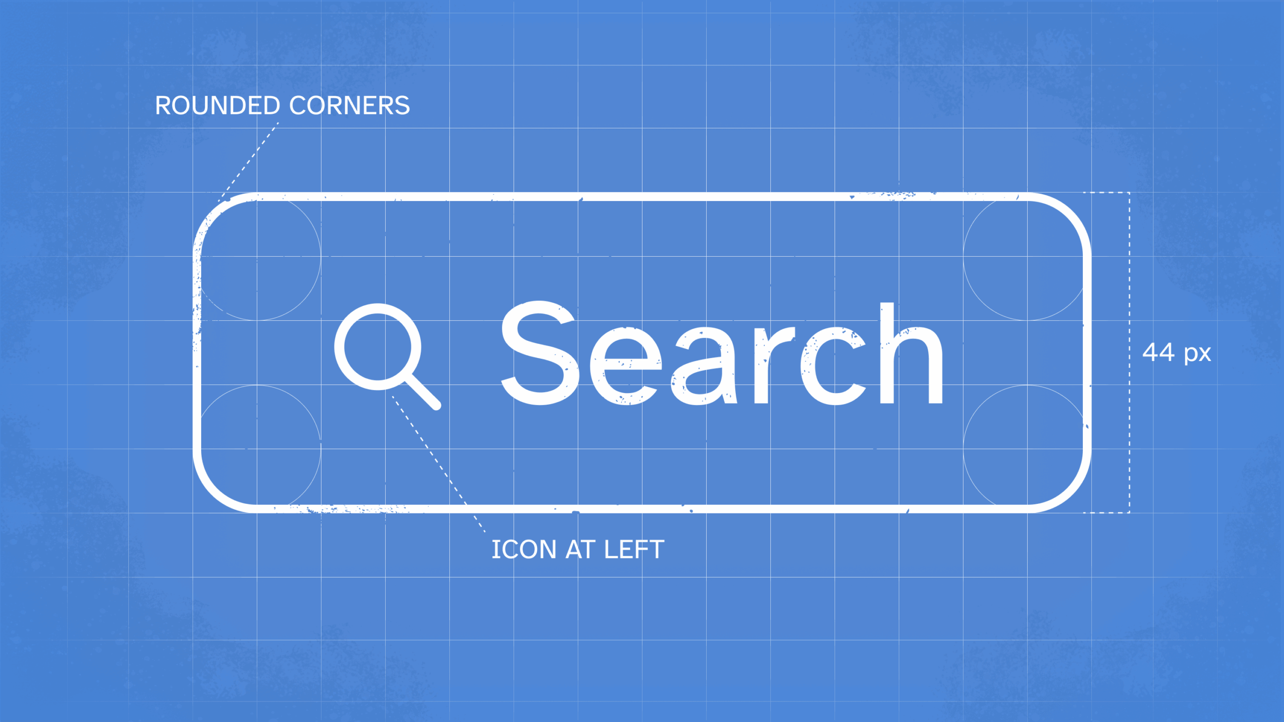
You’ve designed your button types and their states — now let’s talk about sizing. Getting the proportions right separates a clickable button from a clunky one.
First up is button width. There are two main approaches here: your buttons can either stay the same width regardless of text length, such as being full-width on mobile devices, or more commonly, they can scale based on padding around the text.
If you’re going with a consistent width, make sure your longest label doesn’t bump up against the edges. Either make all your buttons a bit wider, or — even better — write shorter labels.
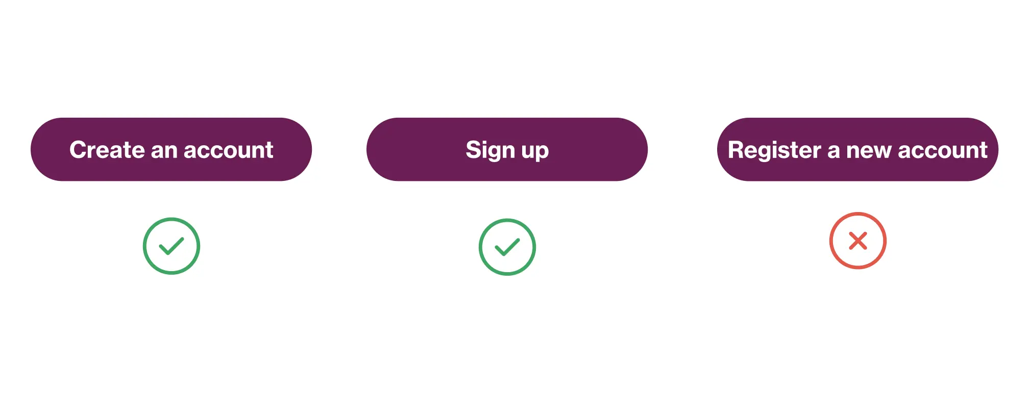
For scalable buttons that grow with their content, there’s no magic formula, but here are some tried-and-true tips:
- Keep your horizontal padding at least as wide as your vertical padding.
- For a really nice look, make horizontal padding about 2- 3 times the vertical
- Set a minimum width so you don’t end up with wildly different button sizes
Sometimes you’ll see buttons that stretch across multiple columns — think of that “Add to Cart” button on product pages that spans the whole details section. This works because users expect it there. But as a general rule, avoid very wide buttons.
It’s important to note that buttons are coded by line height and padding, not total button height. When handing off designs to developers, instead of saying “make this button 40px tall,” try specifying something like “24px line height with 8px vertical padding.”
Even better? Have your developer convert those pixel values to relative units (rem). That way, when users increase their browser’s font size, your buttons scale perfectly along with the text. A handy 24px becomes 1.5rem, and that 8px padding becomes 0.5rem. If you need help with the math, there are plenty of px to rem calculators that can do it for you.
The result? Buttons that look good, work well, and respect your users’ preferences. That’s the sweet spot we’re aiming for.
Now that you’ve conquered button basics, head to part two of our examination of the humble button: Make It Click-Worthy: On Button Accessibility.
At the center of our work is the humanity that connects us all – including our experts and yours. Let us craft proven solutions for your most pressing challenges.
Related Insights