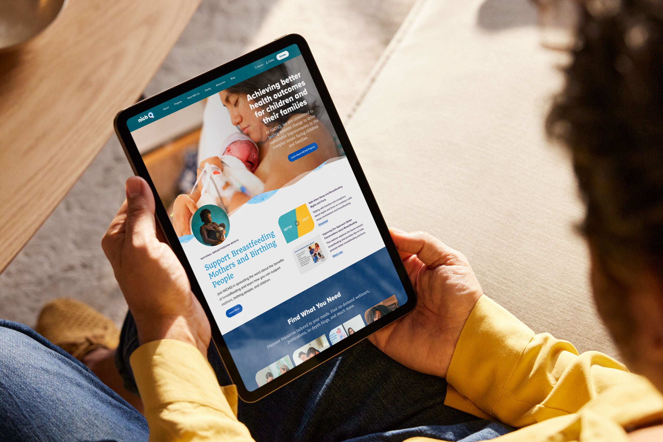
The National Institute for Children’s Health Quality (NICHQ) aims to create widespread change and sustainable improvements to complex issues affecting maternal and child health. Their dedication to ensuring every child achieves optimal health outcomes through quality improvement, research, and collaboration demanded a digital presence that could effectively serve multiple audiences, while reflecting NICHQ’s values of innovation, collaboration, and data-driven impact.
We first engaged with the NICHQ team in building out their National Network of Perinatal Quality Collaboratives (NNPQC) space to create a home for the 52 Perinatal Quality Collaboratives served. This existing relationship allowed us to preview much of what we would face in the digital transformation of the NICHQ website, but our Discovery process highlighted the other needs we would need to address.
Understanding the Landscape
Through our initial NNPQC work as well as stakeholder interviews, we knew NICHQ’s unique organizational strengths: a passionate team committed to transparency, significant subject matter expertise, and a talent for community-building among partners and researchers.
We also uncovered several critical challenges that we needed to address. One such issue was search functionality. In fact, several team members mentioned relying on search engines to find things on their site rather than using the site’s native search. Additionally, the site’s navigation was a common frustration as it didn’t intuitively guide users to the content they sought or showcase the breadth and depth of NICHQ’s projects, teams, and professional expertise.
The existing website was dated, both aesthetically and functionally, with limited mobile responsiveness and a visual identity that resembled a children’s hospital. Finally, technical SEO issues, including duplicate title tags, broken links, and missing meta descriptions further limited the site’s functionality and searchability.
Personalized User Journeys
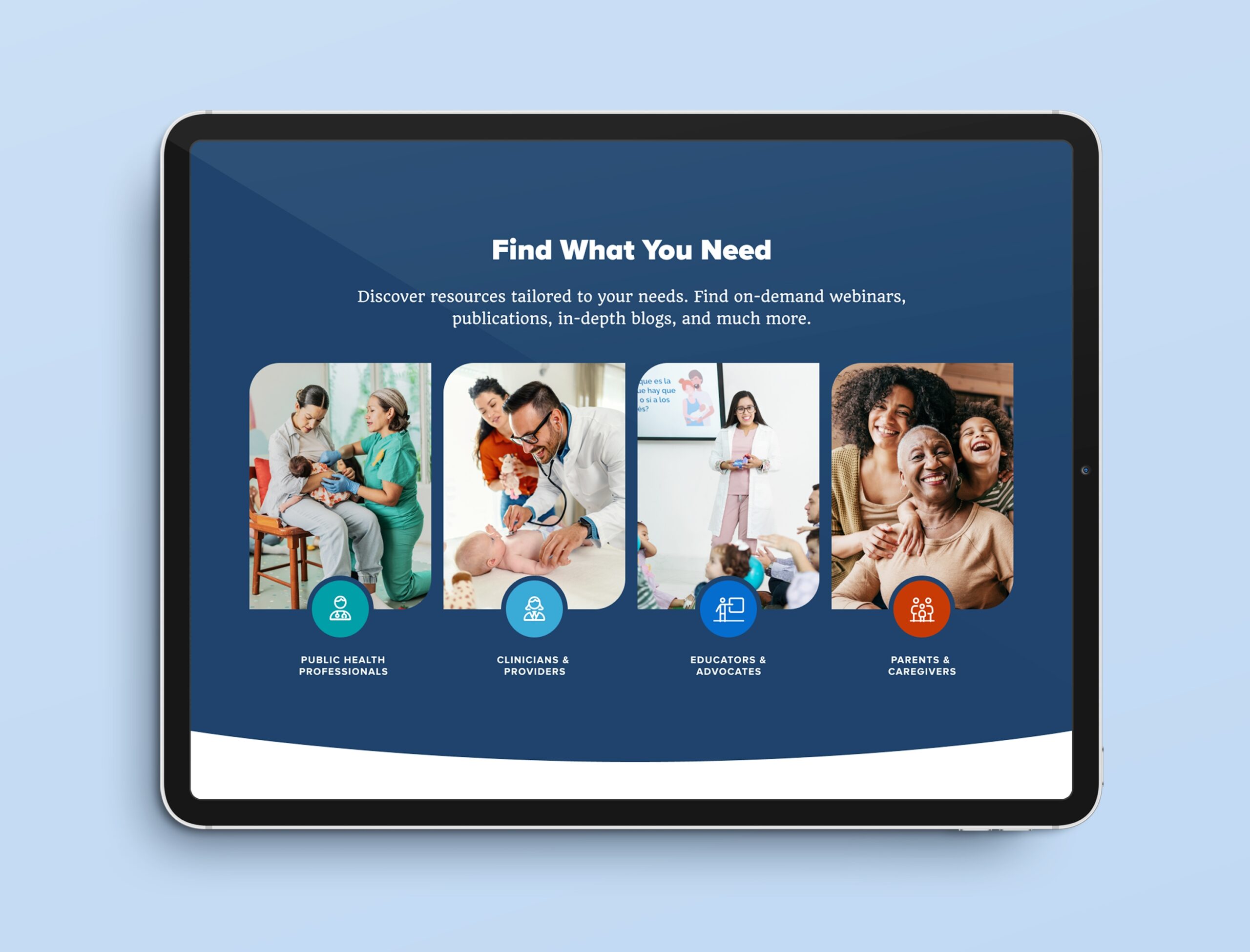
Beyond overcoming the challenges of the existing website, we identified opportunities to better serve NICHQ’s audiences. The NICHQ team had already identified their top 10 audiences, but there was no means of personalizing their experiences on the site. Using the traits their team had identified, we created four critical audience groups: public health professionals, healthcare providers, educators and advocates, and parents and caregivers. Meeting the disparate needs of these four audiences demanded that we create user journeys tailored to each.
Crafting a Professional Yet Approachable Identity
When approaching the site’s new design, we knew that moving away from the children’s hospital aesthetic required a delicate balance. The new visual identity needed to be professional and credible, while remaining approachable and hopeful.
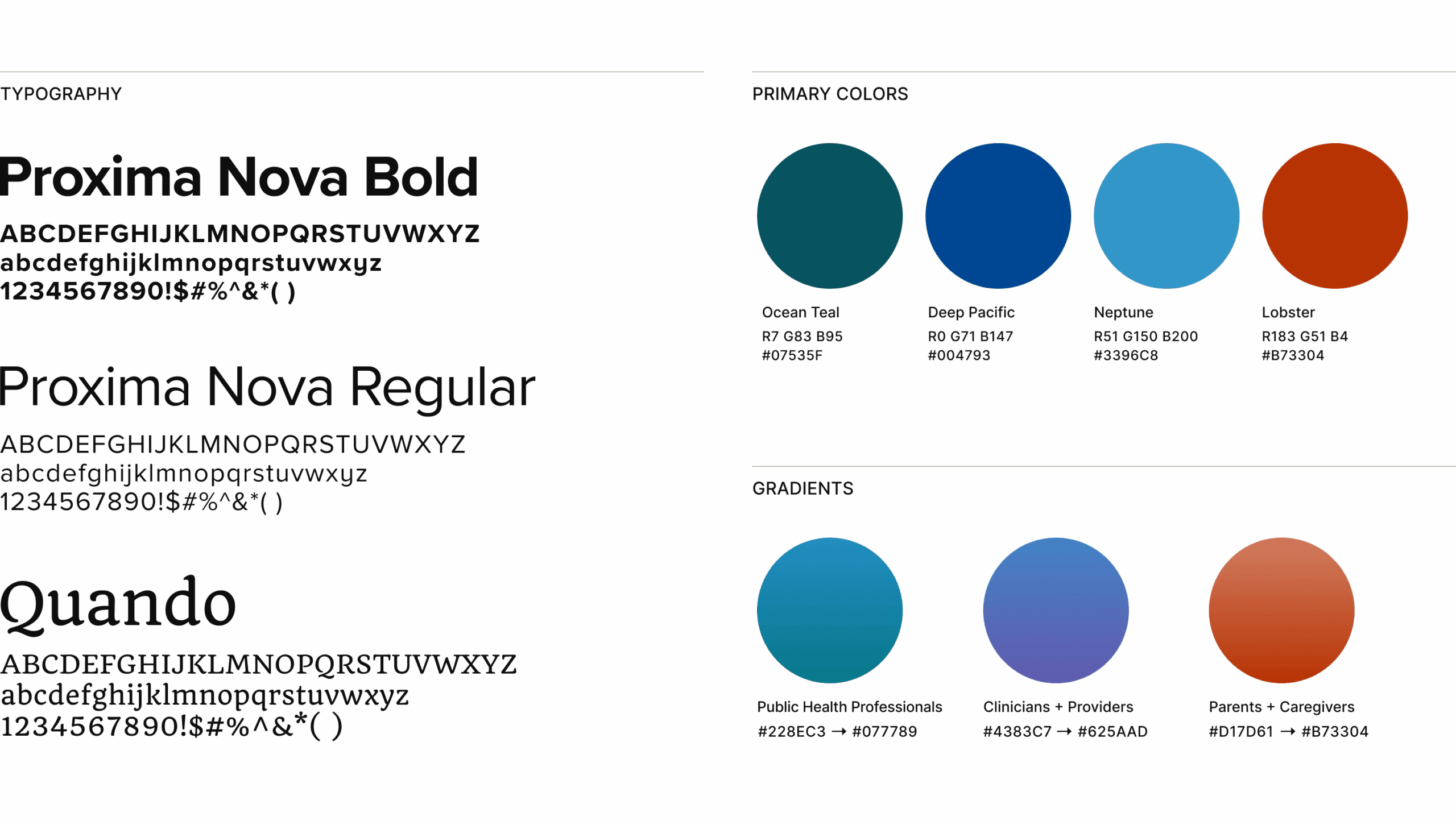
The NICHQ team had already identified a color palette and created a mood board inspired by ocean colors and how water serves as a metaphor for concepts in maternal and child health. To complement this theme, we incorporated watercolor gradients and soft curves in our components when possible. These elements also evoked the softness and subtlety of maternal care rather than the harshness of a sterile clinical setting.
Our typography selections maintained this softness without abandoning the professional tone required of a leader in the maternal and child health space. Additionally, we opted for a warm grey font instead of black to maintain that softer, inviting look.
In selecting photography for our high-fidelity designs, we were intentional in choosing photos that reflected the range of communities NICHQ serves, prioritizing authentic, realistic imagery over idealized representations. This visual approach acknowledged many families’ serious health challenges, while maintaining an atmosphere of possibility and positive change.
Creating Intuitive Pathways
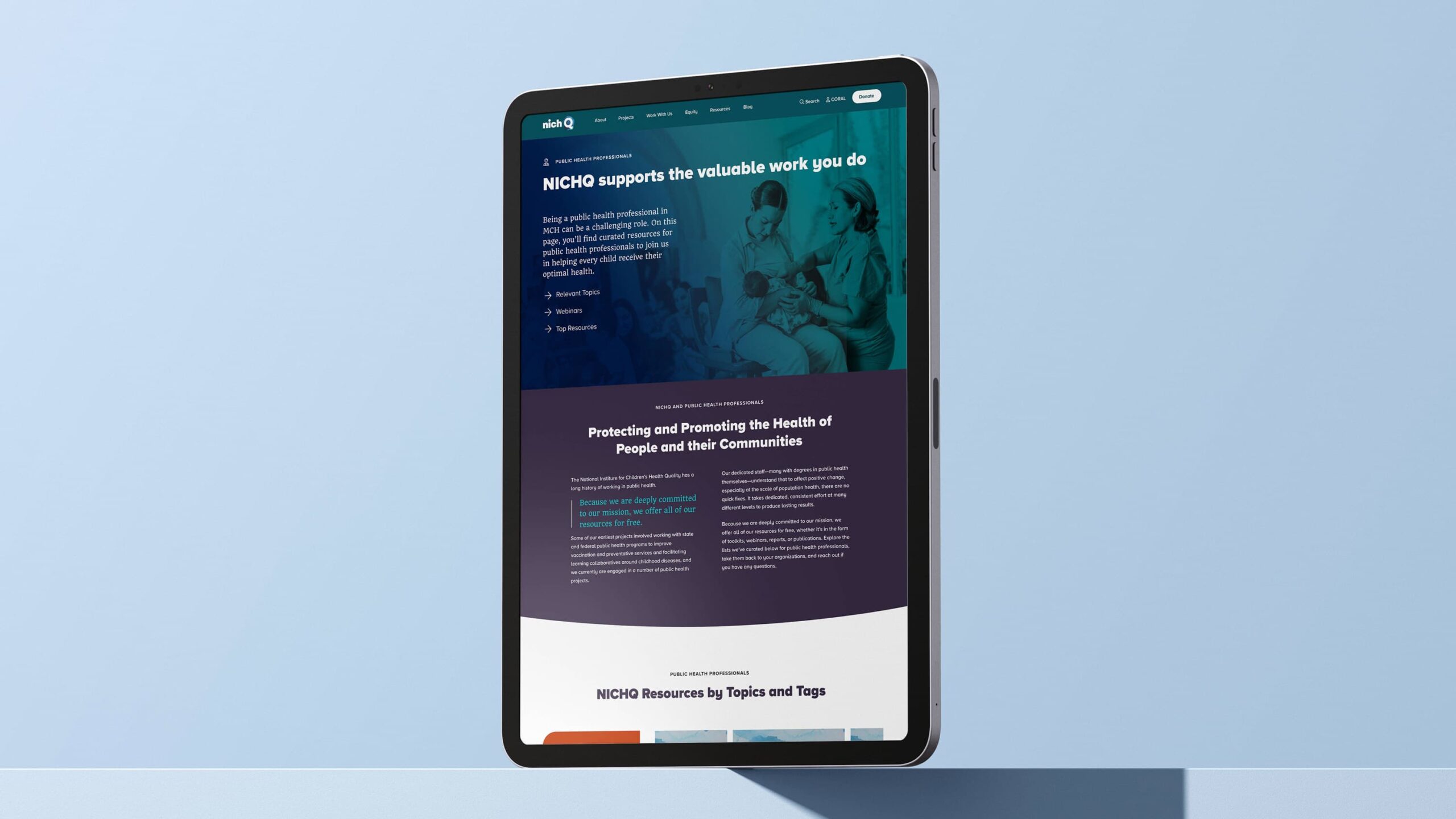
One of the most significant improvements was the restructuring of site navigation and content organization. For each of NICHQ’s four audience groups, we created tailored landing pages that addressed their specific needs and interests. This approach allowed visitors to quickly find relevant information without wading through content meant for other stakeholders.
To improve the site’s navigation, we incorporated a mega menu that offers plain-language descriptions of what users can expect to find at each link, eliminating confusion around project acronyms and niche terminology. We also grouped items in the navigation in alignment with our discovery research and ensured that all projects and teams were adequately represented. Additionally, we created a thorough resources section where users could sort and filter by content type, subject matter, and more.
Improving Searchability, Discoverability, & Usability
In migrating from Drupal to WordPress, we had the opportunity to wipe the search slate clean and start fresh. We implemented best practices, worked with the NICHQ team to define taxonomy, and created 6 custom post types for their resource library. For each page type, we also created content models to assist the NICHQ team in updating existing content, increasing scanability and reader engagement.
To improve discoverability and SEO, we advised on best practices so their team could resolve duplicate title tags, add meaningful alt text to photos, and provide quality meta descriptions. By eliminating missing gated content and broken links, we also improved crawlability, while resolving a potentially frustrating user experience.
Furthermore, the transition from Drupal to WordPress provided a more user-friendly content management experience for the NICHQ team, allowing them to update and maintain their digital presence more easily. This more user-friendly platform also allowed their Communications team the opportunity to delegate specific content updates to the project team leads, empowering them to make updates to their own project pages.
Results That Move the Mission Forward
The redesigned NICHQ website achieved a 73% increase in the Semrush Site Health score, dramatically improving its technical performance and search visibility. But the true measure of success goes beyond metrics.
The new site effectively balances NICHQ’s identity as a bold, innovative thought leader in the maternal and child health space with their commitment to being inclusive, collaborative, and trustworthy. It creates emotional connections through storytelling, while maintaining a professional credibility that supports their mission-driven work.
Crucial to their mission-driven work as well as NICHQ’s ethos, accessibility was fundamental to our approach — not an afterthought. The redesigned site adheres to WCAG standards, ensuring that all users can access NICHQ’s valuable resources, regardless of ability.
Finally, it serves as a hub that welcomes diverse audiences — from healthcare professionals seeking quality improvement resources to parents looking for support — and guides them to the information they need. Through thoughtful design, strategic content organization, and technical improvements, we’ve created a digital platform that truly reflects NICHQ’s mission and expertise.
At the center of our work is the humanity that connects us all – including our experts and yours. Let us craft proven solutions for your most pressing challenges.
Related Insights